Current trends in wine and spirits labels
Textured stocks:
Textured materials like dappled, micro-textured, linen and vellum are becoming more and more popular in the wine and spirits industry. These materials handle embossing and foils very well, creating an unforgettable canvas for design.
Intricate Die Cuts:
Gone are the days of conventional square, rectangle or circular labels. Materials nowadays allow for intricate die cuts and unique label shapes. This ability which materials have allows designers creative license to push the boundaries in label design.
Multiple Labels:
Designers are re-imagining label sizes and again materials this day in age allow for the perfect canvas for such creativity. From adjacent oversized and undersized labels to neck and cap labels to back labels design to be seen trough glass. Multiple labels offer a sophisticated look that provides shelf appeal.
^ averydennison.com/newsroom
As millennial wine drinkers continue to trade up in price and quality, the number of imaginative, non-heritage brands seen entering the market is increasing as well. These new brands draw their personalities from metaphors, sensations and just plain attitude.
Personality-driven, innovation brands are no longer the sole domain of the £10-and-under price point. Wine producers are now choosing to brand increasingly more expensive wines without relying on a prestigious family story or appellation. Instead, these brands are built on imaginative back stories supported by impactful and sometimes unexpected visuals.
Some massive trends within the wine and spirits labels industry is:
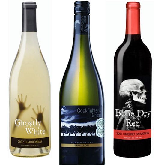
- Sophisticated Horror
- Occult and Mysticism
- Large one colour etchings
- Poster typography
- large brown labels
Below is an image showing some examples of this.
SOPHISTICATED HORROR:
With brand names that could double as titles of murder novels or horror movies, these dark and foreboding personalities are showing up in both mass-market brands — Carnivor Cabernet Sauvignon being one — as well as premium-priced offerings like The Prisoner. The metaphor is apt: The suspense of tasting a new wine for the first time is not unlike waiting for the climax of a horror movie. Often they are gut-wrenching, but there is something that makes us want to see what’s behind the door (or under the cork) time and time again.
This trend appears to have, in part, grown out of the black-and-red label explosion that began over five years ago with brands like Noble Vines’ 337 Cabernet Sauvignon and Apothic Red. Dark labels punctuated by flashes of blood red are the backdrops on which these red wine brands build their stories.
OCCULT & MYSTICISM:
Borrowing from the imagery of Freemasonry and the occult, this category leverages the current interest in secret societies such as the Illuminati. The visual style of the category is characterized by the use of illustrations similar in style to those used on Ouija boards and engravings found on U.S. currency. Many brands labels are depicting illustrations of evil eyes etc. Although their individual backstories differ, these personalities appear to suggest ancient and magical origins.
LARGE ETCHINGS:
Etchings on wine labels are in no way new, but recently, there has been an explosion of labels utilizing large single-color etchings, woodcuts or illustrations. The label for Experience Napa Valley Cabernet Sauvignon by the Refuge Wine Company features an edge-to-edge etching of human figures ascending a ladder into an ink-hatched night sky. Squadra Rosso’s label depicts a determined-looking, goggle-wearing cyclist delivering bottles of wine that he carries on the front of his bike. The uses of these large, hand-drawn images capture the whimsy of a children’s storybook while being sophisticated enough to appeal to adults.
POSTER TYPOGRAPHY:
Largely based on the graphic language of early American advertising, this category relies on dynamically drawn display typography, rather than an identifiable illustration, as the basis of its personality. The inspirations for this category include typography from Victorian-era product catalogs, Italian café posters of the ’20s and ’30s, and lettering found on labels of wooden produce crates from the California Central Valley.
RICH BROWN LABELS:
You’ll be hard-pressed to find anyone who will claim his or her favorite color is brown. Despite that fact, rich brown has become hugely popular among luxury fashion brands and is now finding its way onto wine labels. Reminiscent of fertile soil, warm wood and luscious chocolate, dark brown can help conjure the positive associations that come from drinking a delicious glass of red wine.
The hues of pure cyan, magenta and orange, when individually paired with rich brown, create an especially pleasing complementary effect. The dark values of rich brown also make it the perfect backdrop for metallic foiling. The combination of rich brown and copper foil on labels is the single most popular trend currently on shelves.
By liberating itself from the restraints of traditional heritage stories, the wine and spirits industry has entered a creative brand-building renaissance. Seeing as there are infinite styles of wine and spirits being made, it is only logical that the stories that strive to connect with consumers be infinitely varied as well.
The common thread running through the above-mentioned trends might be best described as “fictional authenticity.” With these brands, as with works of literary fiction, the audience knows in advance they are about to experience a product of someone’s imagination.
^forthrightdesign.com


Comments
Post a Comment