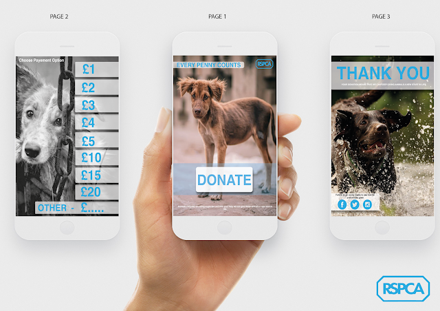
initial app design

Below is my initial design mock ups for the app. I wanted to create a user face which was simple and easy to navigate with a professional minimalist design. The app would consist of three pages; the first being the home page where the user can choose to donate. The second page would be the donate page where the user will be taken to once they clocked on the donate button on the home page. From here the user can choose how much they want to donate. once they have chosen ho much to donate they will be sent to a thank you page where the app recognises there contributions and presents links to the RSPCA social media pages so the user can see and follow where there money is going and what help it is giving.


